Nolan Catholic HS
Images of the two yearbooks created, as well as a few logos and flyers made during my time helping out the students and teachers of Nolan Catholic High School in Fort Worth, Tx.

Keeping Tabs 2016-2017
My second yearbook for Nolan Catholic. 240 Pages, full color, 9x12, printed through Walsworth Publishing.
All layout and design done by myself in inDesign CC on a mac. Cover is matte material with a deboss of the type and elements, in order to convey the look of a daily planner journal carried throughout the interior.

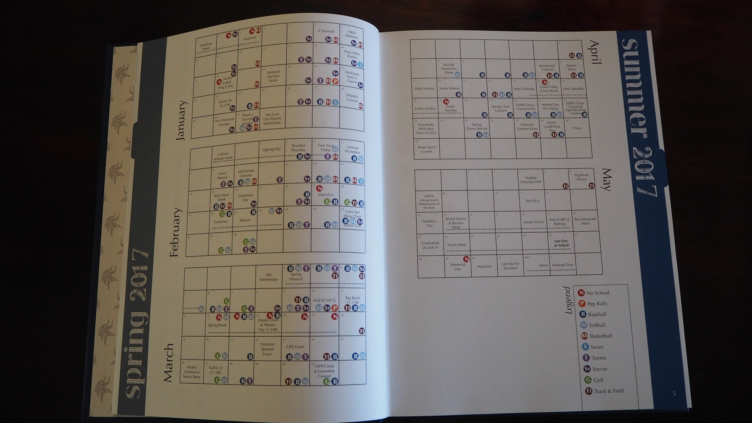
Keeping Tabs, calendar spread
One of the most time consuming part of this theme was my idea to have a full calendar of the school year with as many events as possible shown. These two spreads, one of which is shown, really helped to drive home the day planner feel of this book.

Keeping Tabs, divider page
An emphasis was placed on the events in the school through large images, with secondary focus on the page numbers for quick reference within the section. The boxes for the images were all based off different types of "tabbed" folders to tie in with the theme.

Keeping Tabs, sport spread
With a years worth of games to cover, for multiple levels of the same sport, it can be tricky to work it all into just two pages. Here Highlights from the year took focus to the outside to grab attention when flipping through the book, with the team portraits and text content to the center. Also made use of COB (cut out of background) students throughout the book to feature stand out achievements.

Keeping Tabs, events spread
This example shows the use of spreads to cover more than one topic, which is crucial when you have a limited number of pages. Along the right edge of every spread was a colored arrow, so that when the book was closed you could easily use the tabs to navigate to the section you wanted.

Show Choir
I also worked with the Show Choir director three years in a row to create logos for the students t-shirts. The top in black was based of a students doodle. The center used their slogan for the year, "here comes treble" along with the choir and school name. The bottom was an elegant script that was printed on the pocket of navy shirts.

All Vikings 2015-2016
My first yearbook for Nolan Catholic. 240 pages, full color, 9x12, printed through Walsworth Publishing. Created in Online Design software. Cover is textured like leather, with white printing, and spot gloss inside the triangles.
With limited staff this book was heavy on images with little text on most pages. Strong sans serif font and triangle motif throughout, with empahsis on school colors.

All Viking, double spread
"All Viking, All In" was the full theme for this year. With that in mind I used the center of the pages to keep all the content "in". Events and students are the core of the pages, where the layout draws your eye in and down through the content.

All Viking, spread
Here two related events, school class retreats, are placed on the same spread, but still needed to remain clearly separate. In these cases we utilized the outside corners for the images and let the content tie the events together, often putting elements across pages but allowing the center white space to keep them apart.

All Viking, feature spread
The few pages with stories were given a special look with the feature image taking up nearly a full page, while carrying the double stroke from the cover into the book.

NCHS Library
Working with a local school, the librarian asked for some fun new designs for bookmarks they could print up along with a preset backside explaining the online check out system. I took my inspiration from the Viking mascot as well as their existing internal marketing.
The logo was taken from sketch and into illustrator and combined the worlds contained within open books with the viking imagery and the schools current shield crest.
