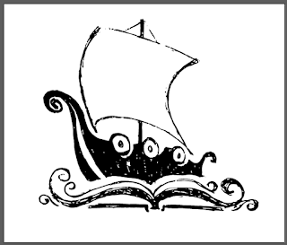
Library Logo
I was asked by our school's librarian to help out with some bookmarks and as I haven't had a lot of creative work outside of my normal day to day, and the yearbook, it was fun to put my brain into another gear.
The school mascot is the Viking and all the direction I was given was "a viking reading", and so my first idea was to simply look around some cool stock photo sites and see what they had, which was not a lot... But a few of the vector ideas were cool and got my wheels spinning. I thought it might be nice to show you my thought and work process here.
So here is the original inspiration logo I had seen on iStock. A pegasus in a book... not sure how it got onto my viking search, but something about the pegasus shape reminded me of a boat and the scrolls reminded me of waves...
Before I knew it I had sketched out an idea for a logo for the library. This is not what they asked for, but I figured I could use it on the bookmarks in any case, if I liked it. You can see I was messing with the sail shape in pencil, but the inked over strongly the final shapes I did like. Then I simply snapped a picture with my phone and emailed it to myself.
Took my sketch into Photoshop and used color select on the blue to make a new, rough, one color image that I could take into Illustrator.
In Illustrator used the Image Trace function, set to Black and White logo, to get a vector drawing I could start messing with. Of course it came out really messy, so the first step was to use the Path tool to Simplify the shape and remove a bunch of extra points that I didn't need. Then I went back and took out even more points by hand so I could start getting clean simple curves and shapes.
I worked on it in three sections, the book/waves, the boat itself and finally the sail. The shapes around the shields on the side of the boat and the sail both ended up changing from my sketch. And I spent a good amount of time getting the left side of the water/book area right and then simply copied and flipped it to make the book be a perfect symmetrical image.
After tweaking the boat to where I liked it, I took the circle shape from our school logo and changed the bottom text to Library. Then I added my new library stuff to the center.
Finishing touch was to add the school shield to the sail of the boat and tweak the blue color to be more of the correct color for the school (even though we do not have a set Pantone blue which would be a big help...).
Well the librarian loved the logo and we are still working on a few ideas for the bookmarks themselves, but this was a pretty fun little tangent for my brain to take.
Note: The first and third are using stock images from Shutterstock along with my new logo. The middle has a quote from my favorite book on it, get it on Audible if you love yourself.
Difficulty: Intermediate
Time to complete: 4-6 hours
The school mascot is the Viking and all the direction I was given was "a viking reading", and so my first idea was to simply look around some cool stock photo sites and see what they had, which was not a lot... But a few of the vector ideas were cool and got my wheels spinning. I thought it might be nice to show you my thought and work process here.
So here is the original inspiration logo I had seen on iStock. A pegasus in a book... not sure how it got onto my viking search, but something about the pegasus shape reminded me of a boat and the scrolls reminded me of waves...
 |
| Photoshop one color selection |
 |
| Illustrator expanded trace |
In Illustrator used the Image Trace function, set to Black and White logo, to get a vector drawing I could start messing with. Of course it came out really messy, so the first step was to use the Path tool to Simplify the shape and remove a bunch of extra points that I didn't need. Then I went back and took out even more points by hand so I could start getting clean simple curves and shapes.
I worked on it in three sections, the book/waves, the boat itself and finally the sail. The shapes around the shields on the side of the boat and the sail both ended up changing from my sketch. And I spent a good amount of time getting the left side of the water/book area right and then simply copied and flipped it to make the book be a perfect symmetrical image.
After tweaking the boat to where I liked it, I took the circle shape from our school logo and changed the bottom text to Library. Then I added my new library stuff to the center.
Finishing touch was to add the school shield to the sail of the boat and tweak the blue color to be more of the correct color for the school (even though we do not have a set Pantone blue which would be a big help...).
Well the librarian loved the logo and we are still working on a few ideas for the bookmarks themselves, but this was a pretty fun little tangent for my brain to take.
Note: The first and third are using stock images from Shutterstock along with my new logo. The middle has a quote from my favorite book on it, get it on Audible if you love yourself.
Difficulty: Intermediate
Time to complete: 4-6 hours


