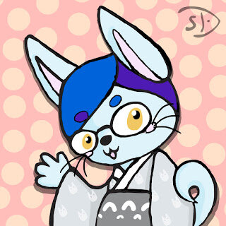
Khyarete Cat
So following the ideas from last post, I spent a little time coloring the doodle that I ended up with.
First Step: Trace the image that I orignially drew and line shaded so that Illustrator can render me some clean outlines.
Step Two: Photograph trace and take into Photoshop. Use healing brush to get rid of the smudges, then an adjustment layer to balance out the shadow. Then I always adjust the layers to get as much dark and light as possible.
Step Three: Bring adjusted image into Illustrator and use Live Trace tool to get some rough outlines that I can then take BACK into photoshop.
Step Four: Open a new canvas at the size I want. In this case avatars are square so I just picked a 5"x5" canvas to use. Drop in the line art from Illustrator.
Following this I give the line art its own layer, rasterize it, erase the messy bits and thicken with a black round brush. Color blocking and palette choice is next where I paint some round blobs out together to see how they look. Then I color in the largest sections in their primary tone.
Create a new layer for shadows and larger details, like fixing the eyebrows and cheek dots. Shading the fur and kimono goes on this layer as well.
New layer for eyes is next. I always do them separate since I never usually like them and then can move them around the eyeball as I like if I don't like where I initially drew them.
New layer for the Kimono pattern. They are white chibi totoros. I put this on its own later after making a ton of layers and merging them for each totoro shape. Then I decreased the opacity to get it to look like it was on the fabric.
Then I made two layers for the background dot pattern thing. This part was hard. I just picked two colors to make two layers and then erased dots out of one to put over the other. I then gave the top color a Hue Saturation adjustment layer so that I could mess with the tones without having to recolor the whole thing. Still not sure I like the background colors, but they will do for now.
I decided at that point that the cat was blending into the background and she needed a shadow. Easiest way is to duplicate the line art layer and fill it in with black creating a black shape of the cat itself. Then enlarge it just a bit and lower the transparency on that layer and offset it from the cat to create a drop shadow.
I then had to add my signature mark which I have already in a vector format for this purpose. It gets it's own layer as well.
Done... for now.
First Step: Trace the image that I orignially drew and line shaded so that Illustrator can render me some clean outlines.
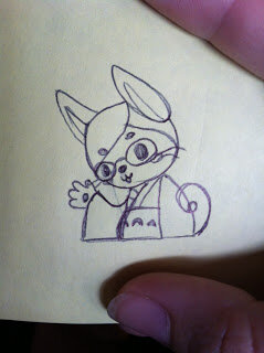 |
| Doodle-trace on a sticky note. |
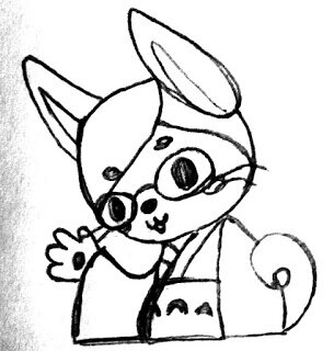 |
| Photoshopped: Not always nicer. |
Step Three: Bring adjusted image into Illustrator and use Live Trace tool to get some rough outlines that I can then take BACK into photoshop.
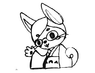 |
| Line art at this point looks like a messy ink drawing. But it's vector! |
Following this I give the line art its own layer, rasterize it, erase the messy bits and thicken with a black round brush. Color blocking and palette choice is next where I paint some round blobs out together to see how they look. Then I color in the largest sections in their primary tone.
Create a new layer for shadows and larger details, like fixing the eyebrows and cheek dots. Shading the fur and kimono goes on this layer as well.
New layer for eyes is next. I always do them separate since I never usually like them and then can move them around the eyeball as I like if I don't like where I initially drew them.
New layer for the Kimono pattern. They are white chibi totoros. I put this on its own later after making a ton of layers and merging them for each totoro shape. Then I decreased the opacity to get it to look like it was on the fabric.
Then I made two layers for the background dot pattern thing. This part was hard. I just picked two colors to make two layers and then erased dots out of one to put over the other. I then gave the top color a Hue Saturation adjustment layer so that I could mess with the tones without having to recolor the whole thing. Still not sure I like the background colors, but they will do for now.
I decided at that point that the cat was blending into the background and she needed a shadow. Easiest way is to duplicate the line art layer and fill it in with black creating a black shape of the cat itself. Then enlarge it just a bit and lower the transparency on that layer and offset it from the cat to create a drop shadow.
I then had to add my signature mark which I have already in a vector format for this purpose. It gets it's own layer as well.
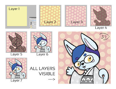 |
| So you can see the layers... |

