2013-2014 Show Choir Logo
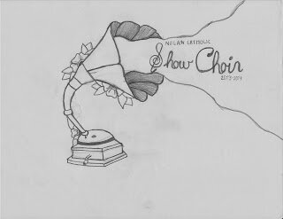
So as you might remember, last year I worked up a quick logo for the Nolan Catholic HS Show Choir. Well once again I was asked to do this years. I was given a sketch to go from and the information that they would like to have all 20 kids names included.
With my old file at hand and the sketch done by one of the students in hand I set out to try to replicated it in a way that would look nice.
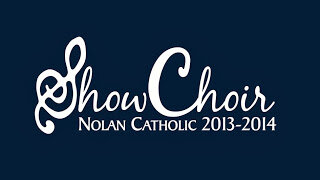
The front was simple enough. The shirts would have an updated Show Choir logo as well as the dates, in a normal placement on the breast. Clean and simple.
The back however was a different matter. Since it would have the names of the students it needed to be larger and incorporate the sketch that I was given.
Step one was to take the sketch and try to recreate it in Illustrator so it could be clean and I could easily change up the colors to see what looked best. It also needed to be scaled to the larger size that the back design needed to be legible. I sent in this to make sure that even though I changed it up a bit they still liked it and felt it was close to the original intent. At this point the shirt color had not been decided as it was up to a vote.
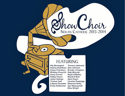
The original thought for the student's names was to have them in the cloud of sound coming out of the phonograph, but with the text of the Show Choir logo overtop the text of the names it might have been a bit too busy. I presented a different option of using a record sleeve. At this point they had voted on a navy colored shirt and we threw out the idea of using white and gold printing.
I tried to make the design tight and self contained so that it would look nice centered on the back of a shirt. I also played with the colors of the lines and the fills. I also soon realized that black on navy is almost illegible. Those black outlines were not really cutting it. You can also see that in one, I removed the ornamental flowers since they seemed to get lost and distract the eye. I also added in a record sleeve as my idea for how to incorporate the names of the students. There was a few rounds of going back and forth on just printing in gold and white and no black, but none were really as sharp as it needed to be.
I then got the suggestion to make the navy shirt be the outlines and text, and just have the areas around filled with the gold and white printing. It took a little work, but once I started working it was clear that it was much better. I also realized that with the record sleeve in perspective that I would have to make some names smaller than others, and I did not want that to be the case, so I changed it as well.
I sent it in and we all agreed that it was done.
Cant wait to see what it looks like in real life!
With my old file at hand and the sketch done by one of the students in hand I set out to try to replicated it in a way that would look nice.
The front was simple enough. The shirts would have an updated Show Choir logo as well as the dates, in a normal placement on the breast. Clean and simple.
The back however was a different matter. Since it would have the names of the students it needed to be larger and incorporate the sketch that I was given.
 |
| Sketch by Student Mandi O'Neal |
The original thought for the student's names was to have them in the cloud of sound coming out of the phonograph, but with the text of the Show Choir logo overtop the text of the names it might have been a bit too busy. I presented a different option of using a record sleeve. At this point they had voted on a navy colored shirt and we threw out the idea of using white and gold printing.
I tried to make the design tight and self contained so that it would look nice centered on the back of a shirt. I also played with the colors of the lines and the fills. I also soon realized that black on navy is almost illegible. Those black outlines were not really cutting it. You can also see that in one, I removed the ornamental flowers since they seemed to get lost and distract the eye. I also added in a record sleeve as my idea for how to incorporate the names of the students. There was a few rounds of going back and forth on just printing in gold and white and no black, but none were really as sharp as it needed to be.
I then got the suggestion to make the navy shirt be the outlines and text, and just have the areas around filled with the gold and white printing. It took a little work, but once I started working it was clear that it was much better. I also realized that with the record sleeve in perspective that I would have to make some names smaller than others, and I did not want that to be the case, so I changed it as well.
I sent it in and we all agreed that it was done.
 |
| Final Back Design |


